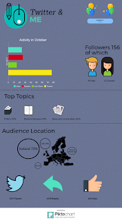
Thing 8 infographics
Infographics
I'm a bit late with this one and I haven't forgotten thing 7 either I just waiting for access to some photos for the exhibition I hope to make. I didn't particularly enjoy this task. It involves being creative and slightly arty which I'm not so over all I'm not happy with the results. I have used both canva and piktochat before and really like them both and can see the benefit of using them. Reports full of figures are very dry reading and can be very long which may get ignored or skipped over by management. This is a great way of giving facts and figures are dynamic presentation. While I was looking at examples for infographics I came across a few great ones. Photos are rarely used in them but the 12 classic sauses was fantastic it was readable, eye catching, everything was laid out well it was divided up clearly through a use of colour and text. It can be seen here
I tried to use a menu card as template and use photographs rather than graphics to be different.
What I found interesting is that while reading for this task there are several font types that are better use to suit dyslexics or those with difficultly reading or indeed reading from a screen. Canva had none while piktochat had at least four.


Comments
Post a Comment